


Kickoff
I joined the Camps U project in the later stages to strengthen the product’s understanding of its target audience. Camps U is a mobile platform designed to help families and athletes discover sports and enrichment camps nationwide. My responsibility was to conduct UX research focused on user needs, behaviors, and motivations.
Challenge
The team needed deeper clarity on who the core users were (parents, students, athletes, and camp directors) and what their pain points were in searching and registering for camps. Early designs lacked data-driven insights into how users compared camps, prioritized features (e.g., cost vs. location), and managed registration.
Solution
I identified recurring themes around convenience, trust, and clarity. I analyzed competitor platforms to understand where industry standards succeeded or failed, then developed personas and journey maps to bring these insights into a tangible framework for the design team. This research provided the clarity needed to align Camps U’s direction with the real behaviors and priorities of its audience, ensuring the product was not just functional but also meaningful to the people it served.
See The Research Process Fully Broken Down
Tools


Goals
Usability Testing
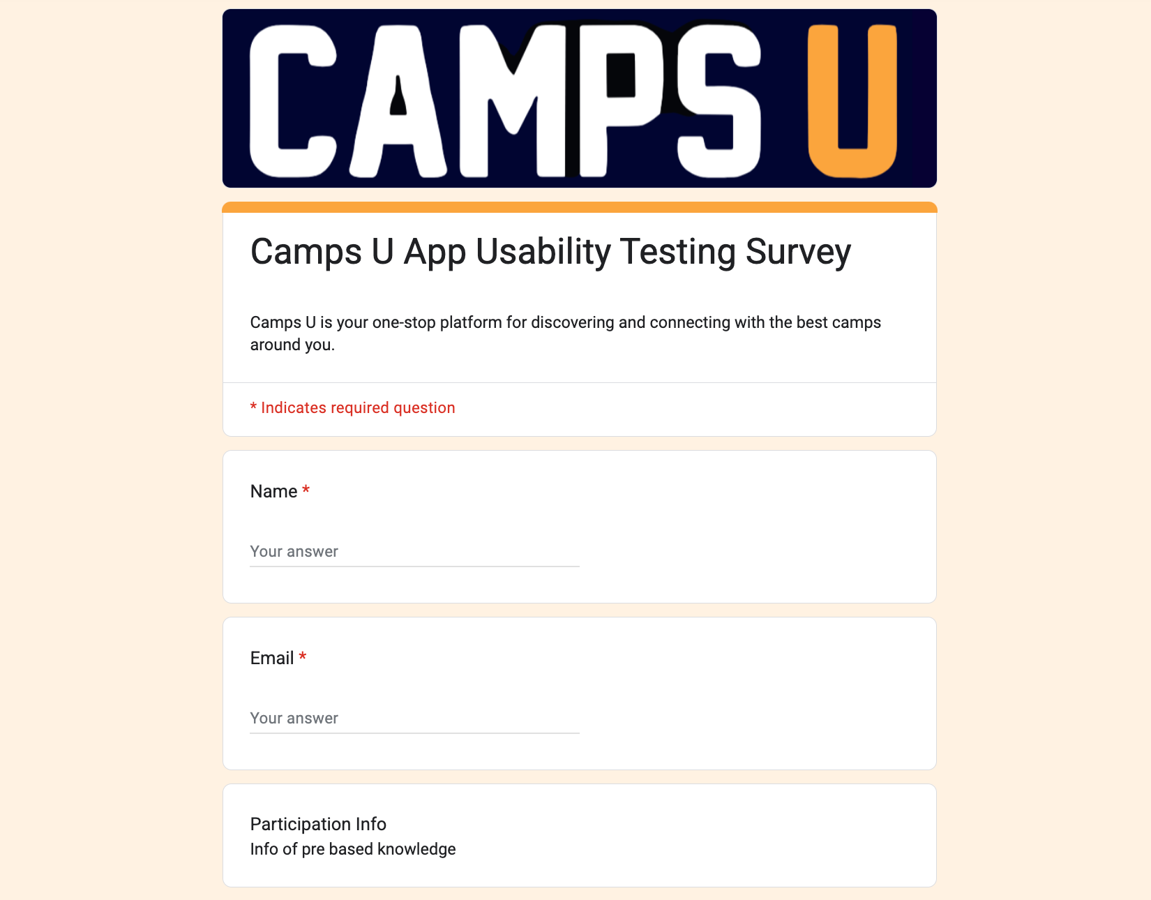
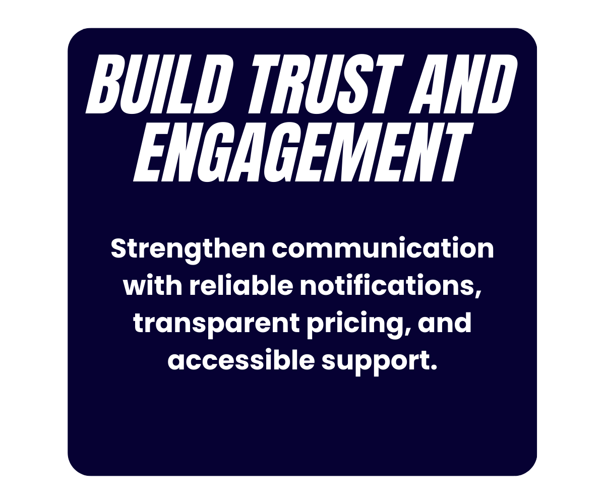
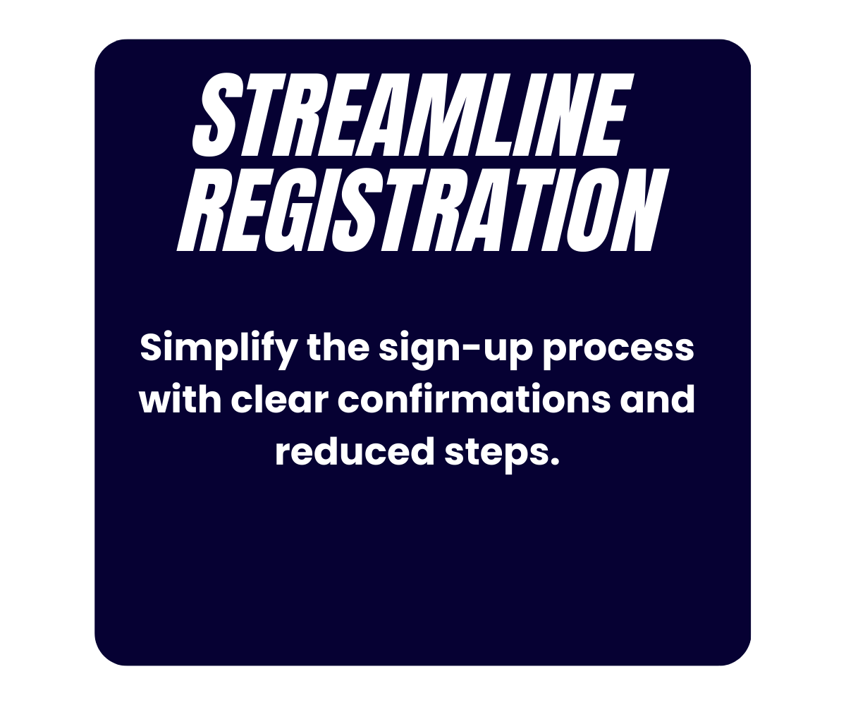
Survey responses revealed that users valued the app’s ability to discover camps quickly but faced challenges with registration clarity, button sizing, and navigation. Many participants reported difficulty finding refund policies and payment confirmations, which reduced trust. Filters and search functions were generally seen as helpful, yet some users requested stronger calendar integration and clearer notifications. Overall, the survey highlighted the need for streamlined workflows, improved accessibility, and enhanced communication features to build confidence and long-term engagement.
UX Research

The sitemap organizes Camps U into clear sections: Home, Explore Camps with filters and details, Favorites, Calendar Integration, Notifications, Profile Settings, and Support. This structure ensures intuitive navigation, efficient camp discovery, and seamless management of registration, schedules, and user preferences.
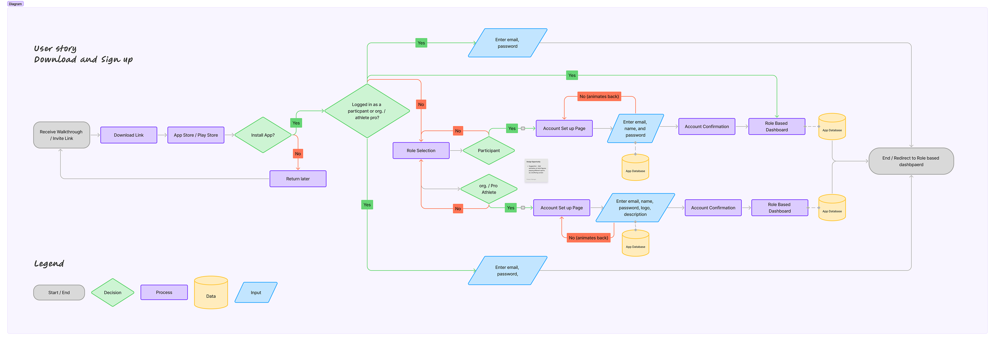
The user flow begins with login or account creation, then moves to searching and filtering camps, viewing detailed information, and starting registration. Additional paths include saving favorites, adding camps to the calendar, and setting notifications, ensuring a streamlined and intuitive experience.
Official Design

Linked Files