

Kickoff
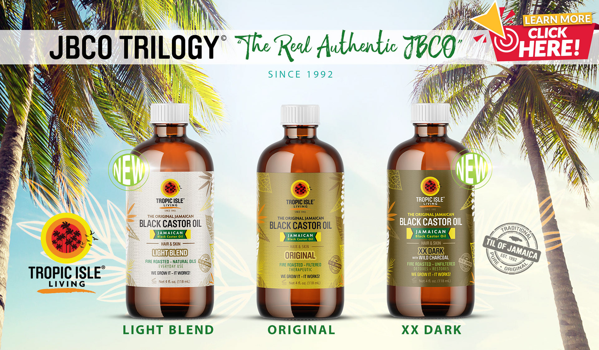
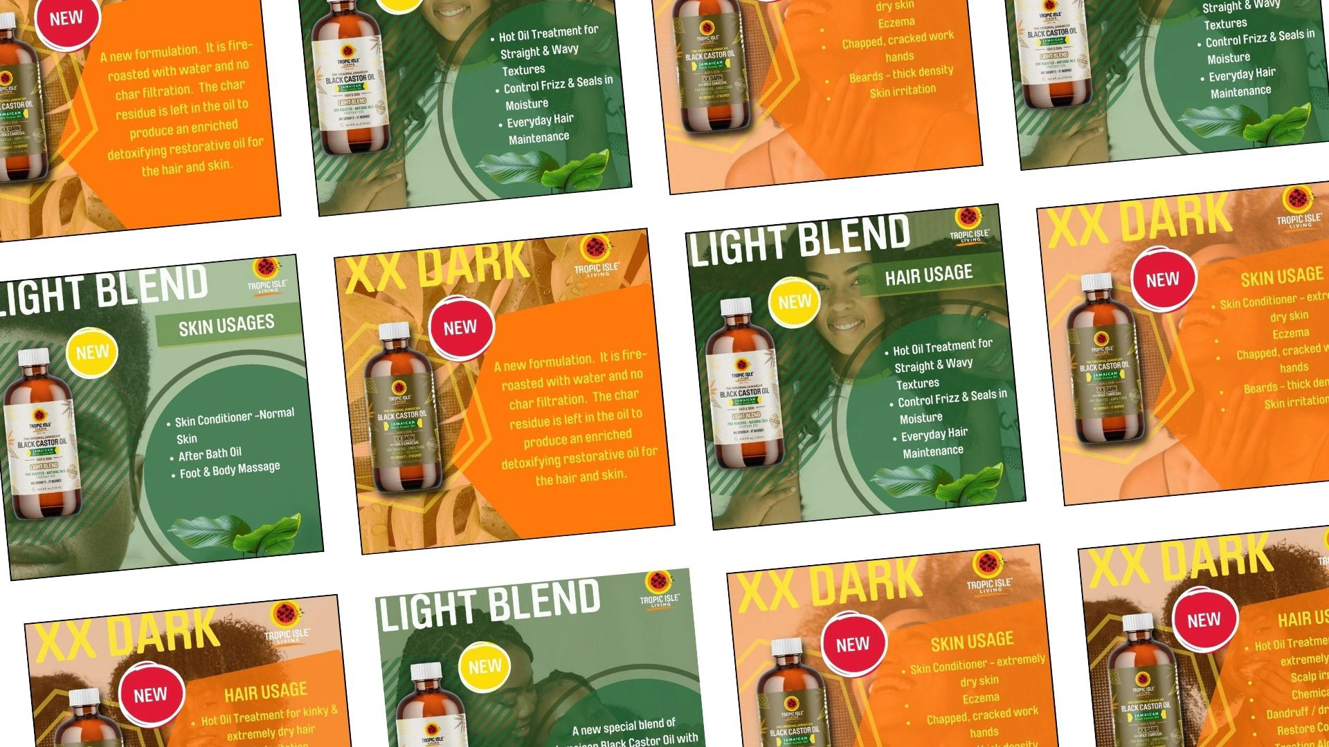
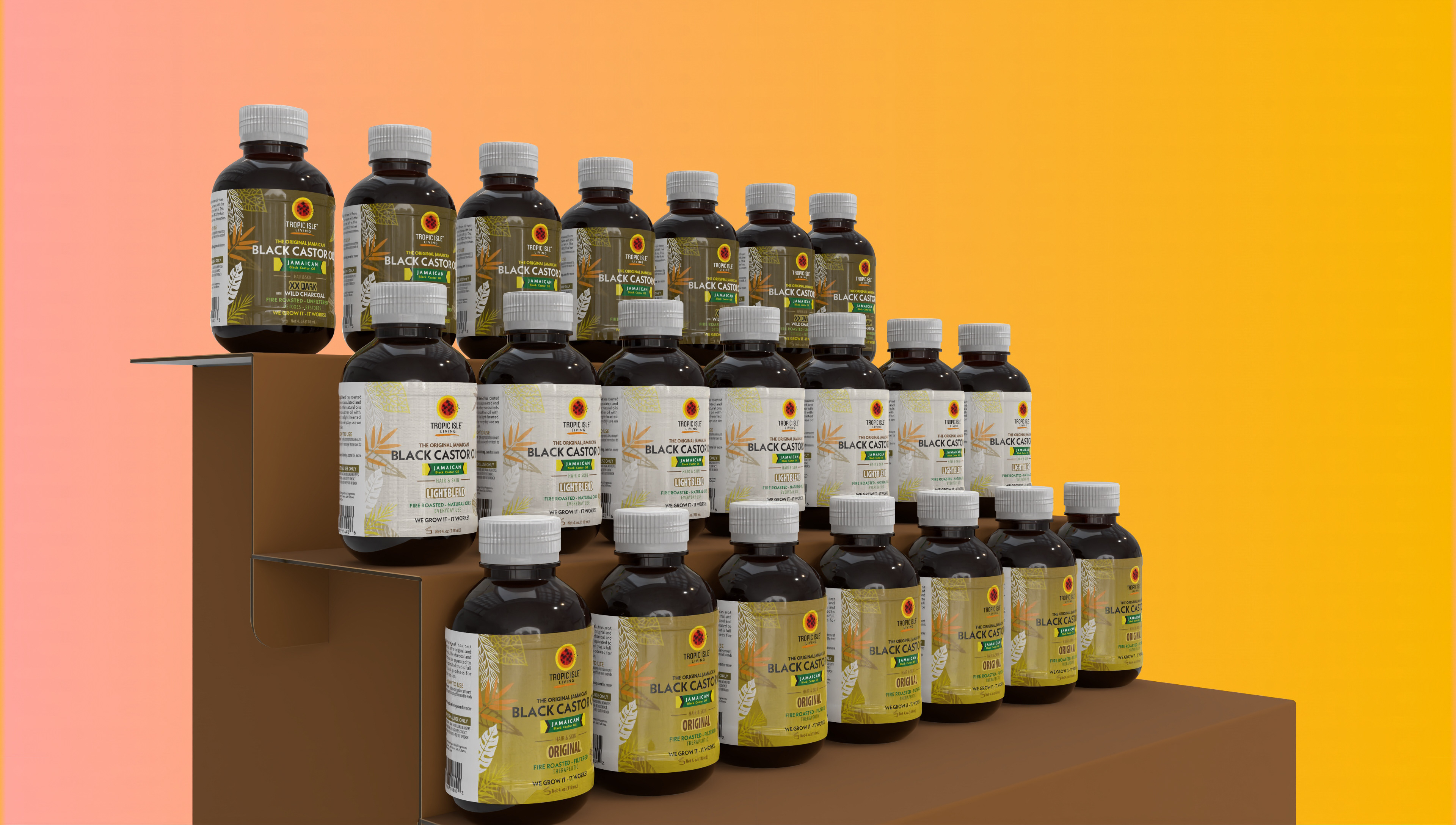
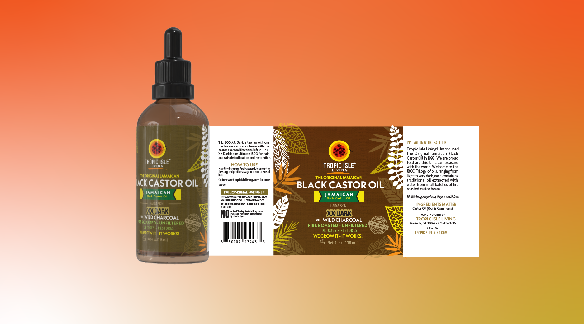
I worked on the launch of new castor oil variants for Tropic Isle Living as part of a three-person design team. My role focused on typography and label layout, helping translate updated product messaging into packaging that felt clear, premium, and shelf-ready. I also supported launch marketing as part of a two-person social design team, creating visuals that introduced the new line and communicated product benefits in a crowded beauty market.
Challlenge
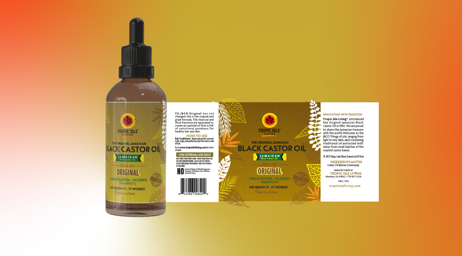
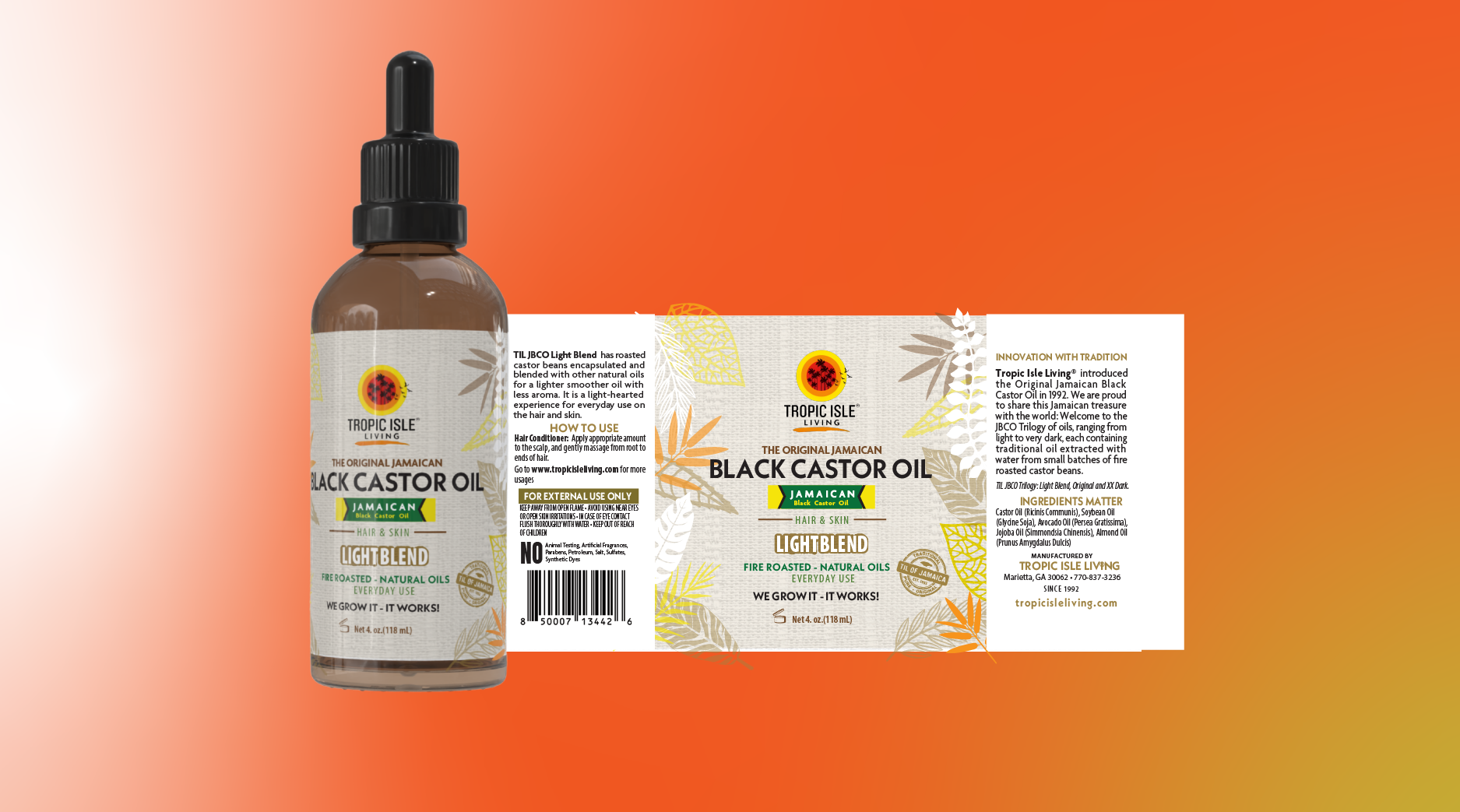
This launch had two design challenges. First, we had to introduce a new product line in a way that felt distinct within an already saturated haircare category. Second, we needed to communicate why these products mattered to the customer by making the benefits, differences, and purpose of each variant easy to understand at a glance.
Solution
I designed label layouts that made the new messaging easier to scan by emphasizing product names, variant distinctions, and benefit-driven copy through stronger hierarchy and cleaner composition. This helped the packaging feel more intentional and easier to understand, without losing the brand's bold visual identity.
For social, we created launch graphics that mirrored the packaging language and introduced the line with a clearer, more customer-facing message. Together, the packaging and marketing assets helped present the new products as both recognizable and newly relevant.
Tools


Label Design
Ad Graphic